这一节(Lesson 4)更多关注一些设计的概念和注意事项。
Lesson 4 设计原则
图表类型
Visualization for data science is:
- simple solution to solve problems
- choose the right tool (chart)
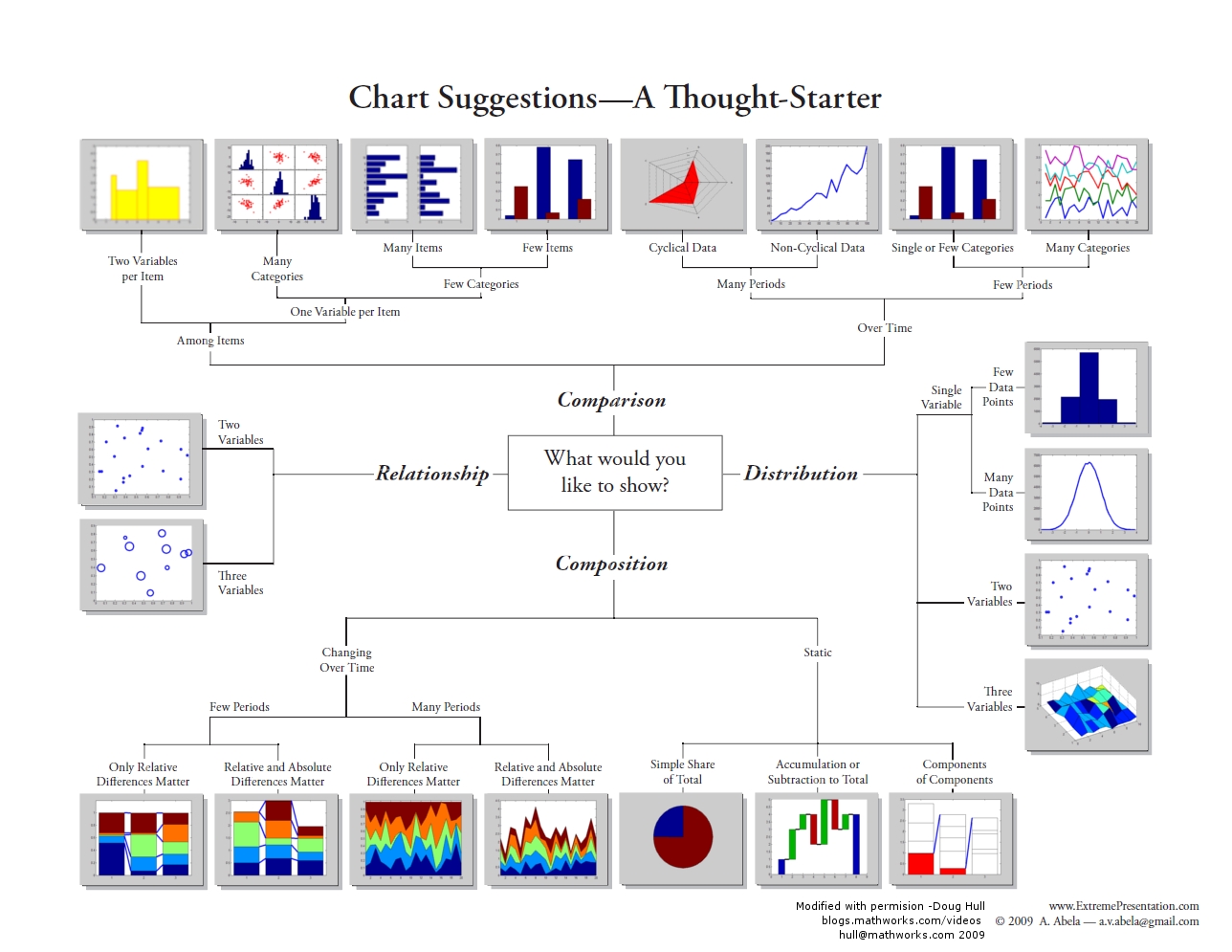
- Selecting the Right Graph for Your Message
- interactive chart chooser
- Designing Effective Tables and Graphs
- table works best when
- it is used to look up individual values
- the values must be compared
- graph works best when
- the message is contained in the shape of data (pattren, trends, exceptions to the norm)
- entire sets of values must be compared
- table works best when
Visual Encoding + Data Types + Relationships (between data) = Chart Type
选择图表类型
可以从两个角度考虑:
- Data Type
- Continuous
- Categorical
- Dimension of data
- 1D
- 2D
- 3D
图表的着重点
条形图 bar chart — 突出显示单个值,支持对比,可以呈现排名或偏差
箱线图 boxplot - 呈现分布和分位数,在对比分布时尤其有用
饼状图 pie chart - 呈现部分到整体的关系,最适合一个类别;不适合进行对比
堆栈条形图 stacked bar chart - 呈现部分到整体的关系,最适合呈现类别和总量的构成
气泡图 bubble chart - 呈现三组以上的值如何变化;呈现相关性
线条图 line chart - 通常在相等的时间间隔上,呈现整体变化和模式
地图 map - 在物理位置上将值进行编码,并且可通过对比位置来绘制模式
散点图 scatterplot - 呈现两组配对的值(例如:身高和鞋码)如何变化;呈现相关性
小多组图 Small Multiples - 分布在一个坐标方格上的一系列图,通常用于展示同一组数据的各个方面(比较)
箱型图 Box Plot - 一组箱型图在一个图表中对不同分布情况进行可视化
小多组图和箱型图可用于EDA,了解数据分布情况
表格 Table - 不属于传统意义上的可视化工具,可以对离散的事实、或者没有固有结构或顺序的数据进行展示。可以清楚的看到每一个数据
地图 Map - 可以和其他Visual Encoding方式结合展示地理上的数据
子弹图 - Stephen Few 开发的子弹图是用来替换仪表和量表的,因为它们占用了信息中心太多的宝贵空间。你可以在 wikipedia 上详细了解子弹图。
波形图 - Edward Tufte 发明的这些袖珍图形,用于在小型图表区域内包含大量信息。通过查看波形图,读者可以快速了解历史趋势、异态和指标的当前状态。你可以在 wikipedia 上详细了解波形图。
循环图 - 最初由 Cleveland、Dunn 和 Terpenning 于 1978 年创造。与传统的线条图相比,循环图能够以不同的方式调查时间序列数据。
关联散点图 - 回想一下 Gapminder 数据可视化。在没有动画的帮助下,你可否揭示出随着年份变化的数据中隐藏的模式? Alberot Cairo says “Yes!”. Alberto praises connected scatter plots and shares examples of them on his blog, The Functional Art. Alberot Cairo 说:“可以!”。Alberto 赞美了关联散点图,并且在他的博客 The Functional Art 中分享了一些示例。
小提琴图 - 小提琴图类似于箱线图,唯一区别的是小提琴图在不同的值上呈现数据的概率密度。Nathan Yau 在他的博客 Flowing Data 上描述了可视化和对比分布的小提琴图和其他方法。
Pre-attentive Processing 前意识加工
前意识加工利用人的视觉和感知能力自动处理,来快速识别可视化中的元素。 通常需要200-250毫秒,约等于人们通过面部识别情绪的市场一样。
属性
- Color
- Color Hue
- Color Intensity
- Form (Shape)
- Movement 动态,如Fade in/out, 闪烁
- Spacial Positon
属性之间可以结合使用
参考
负空间
负空间指在物体的形状之间或周围形成的。
负空间 或 空白空间White Space的利用,可以使:
- you can communicate more elegantly, and create design that has a more “clean” look
- you’ll be less likely to use extraneous ornamentation such as rule lines
- you’ll be less likely to change fonts and colors just to differentiate pieces of information in your design.
零数据和缺失数据
无标识
像著名的霍乱地图中,Brewery街道上没有染上霍乱的人,没有对应的图形。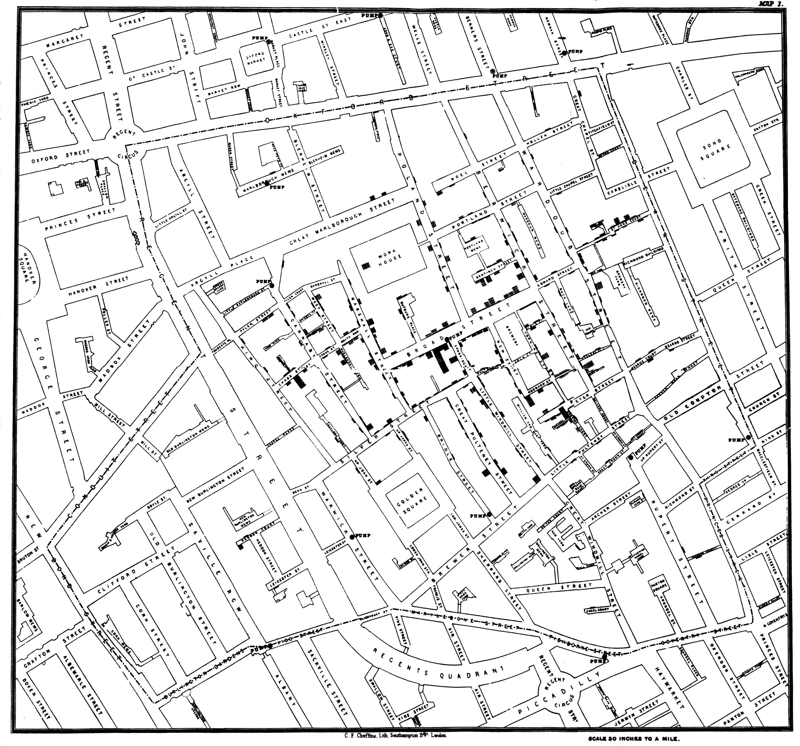
用颜色标识
比如,Gay rights in the US, state by state, 使用灰色来表示未有对应法律
颜色的使用
颜色有时会干扰用户,如果颜色的选择本身没有理由,观众会思考颜色代表的意义(尽管没有),即给图像带带了冗余信息。
- Get it right in black and white (and grey shade).
- Use meduim hues or pastles(轻淡柔和的色彩)
- Use color to highlight
双重编码
有时候,双重编码在 Facebook IPO 等图形中可能会有所帮助。散点图较为复杂,因此双重编码(比如:沿 x 轴的颜色和位置)可以帮助读者理解数据。
颜色使用规则 by Stephen Few
Perception of an object is influenced by the context that surrounds it.
Visual perception is relative, not absolute.
If you want different objects of the same color in a table or graph to look the same, make sure that the background – the color that surrounds them is consistent. Rule #2
If you want objects in a table or graph to be easily seen, use a background color that contrasts sufficiently with the object. Rule #3
Use color only when needed to serve a particular communication goal.
Don’t use color to decorate the display.
Rule #4
Use different colors only when the correspond to differences of meaning in the data.
We use color effectively for three fundamental purposes in data display to promote communication:
- to highlight particular data
- to group items
- to encode quantitative values
Rule #5
Use soft, natural colors to display most information and bright and/or dark colors to highlight information that requires greater attention.
In order to save time of picking colors, pre-set three palettes:
- one of bright, dark colors
- another of medium shades that are easy on eyes
- a final set of light, pale colors.
When objects are small or thin, colors should be brighter and/or darker than otherwise necessary.
Stephen provides three set of palettes sample.
Or we can use Color Brewer, a simple Web-based application to save time.
ColorBrewer divided palettes into three types:
- Categorical - separate items into distinct groups
- Sequential - encode quantitative differences sequentially, from low to high or high to low
- Diverging - encode quantitative differences form high to low then to high (or opposite)
Rule #6
When using color to encode a sequential rage of quantitative values, stick with a single hue (or a small set of closelly related hues) and vary intensity from pale colors for low values to increasingly darker and brighter colors for high values.
Keeping the numbers turned off (invisible) while exploring the data works best.
Rule #7
Non-data components of tables and graphs should be displayed just visibly enough to perform their role, but not more so, for excessive salience could cause them to distract attention from the data.
In graphs, the most common non-data objects are axis lines (excluding tick marks and labels, which do encode data), background fill colors, and borders (for example, around the plot area or legend).
| Component | Default Color |
| ——| —— |
| Axis lines | Use thin gray lines of medium intensity.|
| Borders | Whether around the graph as a whole, its plot area, or a legend, when borders are needed (and usually they are not), use thin gray lines of medium intensity.|
| Background | Use white (or in Excel select “None” for color).|
| Bars | Use a distinct hue of medium intensity for each data series.|
| Lines | For thin lines, use a distinct hue of fairly high intensity for each; otherwise, use distinct hues of medium intensity.|
| Data Points | For small points, use a distinct hue of fairly high intensity for each; otherwise, use distinct hues of medium intensity|
Rule #8
To guarantee that most people who are colorblind can distinguish groups of data that are color coded, avoid using a combination of red and green in the same display.
为了尊重红绿色盲,应避免使用标准红/绿色
参考华尔街日报 (WSJ) 的美国失业率可视化图形-重新设计
Rule #9
Avoid using visual effects in graphs.
总结: 背景色1 / 对比2 / 不滥用颜色3 4 / 适当使用颜色色彩5 6 / 非数据部分不多加装饰7 / 尊重色盲用户8 / 避免使用光效9
格式塔原理
- 接近性:物理上接近的物体属于同一群体
- 相似性:相似颜色、形状、大小或者方向的物体视为相关或从属同一群体
- 图形与背影:观众会将即使是不同形状的物体和背景自动构成图形 (Viewers will perceive an object and a surface even in shapes are grouped together)

- 连续性:视觉倾向于寻找最平稳的路径并自然创造出连续性
- 封闭性:视觉会自动填充图形为可识别的形状
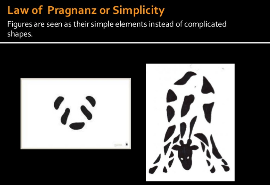
- 简单性:图像会被处理为简单的元素,而非复杂的形状。(Figures are seen as their simple elements instead of complicated shapes)
参考
认知的格式塔原理
Storytelling with Data: A Data Visualization Guide for Business Professionals
The Gestalt Principles
图表的有效性
Data-Ink Ratio
Data-Ink Ratio = Ink used to describe data / ink used to describe everything else
失真系数
用于描述图表的完整性或图表展示数据的效果,通常期望在0.95~1.05之间。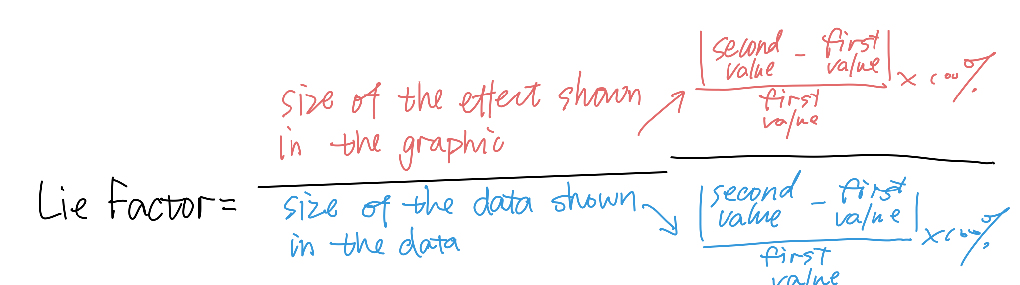
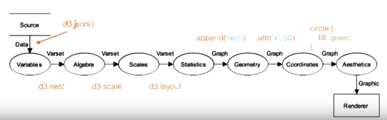
图形语法
将数据或内容与形状分隔开.
关注点分隔
从数据的视觉呈现中分离数据的好处。以下为主要的几点:
- 独立转换并展示数据
- 委派工作和责任
- 工程师关注数据操纵
- 设计人员关注数据的视觉编码
- 展示数据集的多个视觉表征
- 不包括:气泡图和线条图呈现数据集的不同分面。
常见元素
当你想创建图表或图形时,从视觉上分解你希望实现的目的通常很有帮助。在前几段视频中,你看到了如何将图表提取到更为基础的视觉编码中。在地图示例中,你看到的面量图是地形和颜色的结合,而统计图是地形和尺寸的结合。在谈论可组合的元素时,最常见的就是:
- 坐标系(笛卡尔与径向/极坐标系)
- 标尺(线性、对数等)
- 文本注释
- 形状(线条、圆圈等)
- 数据类型(分类、连续等)
构成
当你将这些常见元素组合到一起时,你就能发现图形语法的迷人之处了。例如,你可以在笛卡尔空间中,将数据值映射到条形高度,从而创建条形图。你也可以在极坐标系中映射这些值(数据值对应到切片的径向度数),得到饼状图。
- 分类数据 + 连续数据 x 笛卡尔坐标系 = 条形图
- 分类数据 + 连续数据 x 极坐标系 = 饼状图
- 连续数据 + 连续数据 x 笛卡尔坐标系 = 散点图
你可以通过不同的方式组合这些常见元素,从而创建许多其他的图表。
图形语法与D3