本节主要介绍了Dimple.js的用法(Lesson 5),还有直方图与条形图的比较(Lesson 6)。
Lesson 5 Dimple.js
Dimple.js
dimple.js is a powerful and flexible open-source charting API for d3 letting you quickly and easily create and combine bar, line, area and scatter charts.
http://dimplejs.org/
使用Dimple.js绘制柱状图
先加载D3.js, 再加载Dimple.js
- 识别文本中代码块
- 使用
src属性加载脚本文件
JavaScript调试器
1 | debugger; |
代码中写有调试器,浏览器仍会完全加载?
——需要在加载页面前打开检查工具
AJAX
AJAX 代表异步JavaScript和XM,指web页面在页面加载后进行HTTP请求的过程。
use strict
指定代码在严格条件下执行,只允许出现在脚本或函数的开头。
在严格模式下:
- 不能使用未声明的变量
- 不能删除变量、对象或函数
- 不允许变量重名
- 不允许使用八进制
- 变量名不能使用 “eval” 字符串
- 禁止this关键字只想全局对象
边缘惯例 Margin Convention
define the margin for 4 sides;
1
var margin = {top: 20, right: 10, bottom: 20, left: 10};
define the width, height as inner dimensions of the chart area;
1
var width = 960 - margin.left - margin.right;
define
svgas a G element that translates the orgin to the top-left corner of the chart area.1
2
3
4
5
6var svg = d3.select('body')
.append('svg')
.attr('width', width + margin.left + margin.right)
.attr('height', height + margin.top + margin.bottom)
.append('g')
.attr('transform', 'translate(' + margin.left + ',' + margin.top + ')');
Code for Bar Chart Using Dimple.js
1 | <!DOCTYPE html> |
柱状图的优缺点
(在这个例子中)
优点:
- 突出显示缺少数据的年份(negative space)
- 比较
缺点:
- 图标布局刻板 –> x轴是固有顺序的变量
- Bar Chart适用于分类数据
EDA && Sketching Data Visualization
EDA
- for insight
- erroneous values
- structure
Sketching Data Visualization
- visual layout
- visual encoding
- others & data
散点图的应用
散点图更适用于x轴上各字段不相关的数据,eg:两个定量的关系(分布关系)
Lesson 6 Exercise
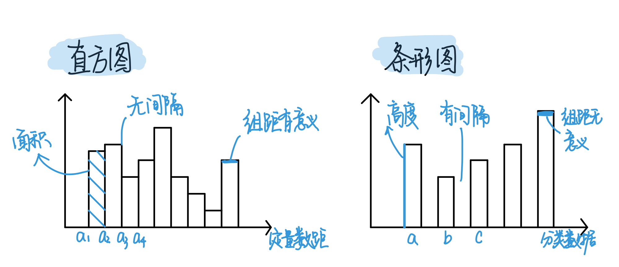
直方图 vs. 条形图
直方图是表示在连续间隔、或者特定时间段内数据分布情况的图表,描述了一组数据的频次分布。
条形图更多表示数据的大小
频次多边形 Frequency Polygon
次数分布图的一种,用于描述一组数据的次数分布,与直方图作用相同。